
A panoramic carousel can make several slides feel like one connected scene. A workbench continues across the panels, a path links stages of a project or a photograph carries the eye toward the next explanation. The treatment works best when the sequence already makes sense without the decorative connection.
Design the information first. Each panel needs a complete point, a readable explanation and enough context to stand alone. A viewer may encounter a shared slide without its neighbors, and a seam should never force someone to reconstruct an important sentence or identify a product from two incomplete halves.
Map the explanation before drawing a long canvas
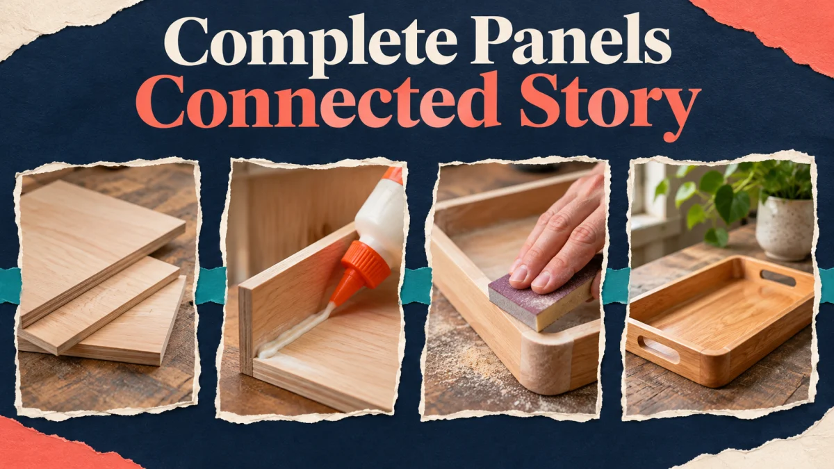
Write the audience’s question and the answer the carousel should deliver. For an illustrative maker, the question might be how a wooden tray moves from rough stock to a finished object. The sequence can explain selecting material, shaping, surface preparation and the final inspection without pretending to teach every workshop skill.
Give each stage a different job. A material panel can explain what is being selected; a shaping panel shows the relevant change; a preparation panel identifies the surface condition; the final panel explains what the maker checks. Repeating “quality craftsmanship” on every slide does not demonstrate the process.
Keep operational limits visible. A finished-product story differs from a safe instruction for using tools. If the carousel cannot provide the context required for someone to perform an action responsibly, describe the process rather than presenting an incomplete how-to guide.
Choose a panoramic element that supports the subject
A continuous workbench can connect the maker’s stages while separate close-ups carry the evidence. A stitched landscape may suit a location story. A ribbon can connect a sequence of decisions. Choose the element because it clarifies a relationship, not simply because the technique looks impressive in a design file.
Decide which details may cross seams. Background texture, a thin line or an unimportant part of the bench can continue between frames. Keep words, faces, small tools and the feature being explained within a panel whenever splitting them would reduce understanding.
Plan a quiet area for each explanation. A continuous photograph can vary in brightness and detail, so one text treatment may not remain readable everywhere. Use a suitable solid area or restrained overlay when necessary, and check the actual contrast rather than relying on a shadow effect.
Build clear frames inside the working file
Create panel boundaries that match the intended export. Keep a master view for continuity and individual frames for checking readability. Use guides to mark internal content areas so that alignment remains consistent as the background crosses between panels.
Check the current upload options and crop behavior in the account’s actual publishing workflow before committing the whole design. Do not assume a fixed slide count or an old template’s dimensions are required. Test a small sample when a mixed-media or crop decision could affect the entire sequence.
Name frames in reading order and keep the exported files equally clear. A reversed pair can turn a coherent process into a confusing one even when the panorama still looks attractive. Avoid filenames that depend on the order your operating system happens to display.
Protect readable content at every seam
Keep essential text comfortably inside each panel. A word split between slides may look clever in a long-canvas preview, but it makes the individual panels incomplete. The same principle applies to an arrowhead or a small feature that identifies the product stage.
Test seam positions against the actual explanation. If the shaping step requires a close view of one edge, move the view rather than slicing that edge across two panels. A panorama should adapt to the content, not force the reader to swipe just to identify what is being discussed.
Check the cover separately. Its job is to make the subject and useful promise recognizable in the previews available to the account. A continuous background can begin there, but it should not weaken the opening or require the next slide to complete the headline.
Write a sequence that rewards continuation
Begin each panel with its useful point, then add a concise explanation or example. Connect the next stage where that helps, but do not withhold the current answer to manufacture suspense. The reader should receive value from the panel before being invited onward.
For the tray example, a panel could explain why the maker checks a particular surface before finishing, supported by a relevant photograph. The next panel can show the completed finish and inspection. Each has a distinct purpose while the continuous workbench establishes their relationship.
Provide the essential explanation in accessible text as well. Image descriptions should identify the meaningful subject and change in each panel rather than repeat “woodworking carousel.” A complex process may need a fuller caption or destination so its meaning does not depend entirely on the panorama.
Review the exported set in two different ways
First, inspect the sequence in order. Check alignment, continuity, repeated elements and transitions. Then shuffle the panels and examine each separately. Can a reviewer identify the subject, stage and main point without your narration? That second pass catches dependencies hidden by the attractive master view.
Open the exports on a phone at ordinary viewing size. Inspect body text, captions inside photographs and small source details. If you must zoom to read a necessary qualification, simplify the layout or move information into a more suitable format rather than deleting the qualification.
Use the publishing preview to confirm order and crop before release. If the workflow changes the presentation, adjust the source and re-export the affected panels consistently. Preserve the approved set together so a later teammate does not mix an updated slide with an old seam.
Keep the panorama useful after publication
Save the audience question, master file, panel exports and descriptions in the same project record. Note any facts or destinations that need review. Put that ownership into the Instagram marketing action plan so maintenance is part of the work.
For a broader review of profile and content presentation, use the Instagram course preview. Apply the same standard to the panorama: the connected design should make the explanation easier to follow, while every panel remains a useful, accurate piece of the story.